EDITED TO ADD: Just in time for this post, I noticed that Simon Says Stamp is having a 20% sale on all Simon Branded Products - which includes the felt, inks, and card stock that I have in this post! Just a dab of enabling! Heehee! :)
Hello! Recently when Simon Says Stamp had their Spring Plush release, I splurged and picked up the Huge Assortment of Felt - I was having so much fun, and wanted ALL the colors! I did, however, wish that there was more that I could see - a close up of the colors and such. So...I decided to put one together for anyone else that might be wanting one!
I'm not sure if each package has the exact same quantities, or if it is a little more random, but I listed each color and how many of each I received. I tried to match them up the *best* that I could with SSS dye inks and card stock - with the thought that it would simplify color coordination on a card or project where they were being used together. While I have all the colors of card stock, there are still a few holes in my ink collection. As I fill those in, I hope to update this post - so stay tuned!
Keep in mind that how you see these colors will depend on your computer monitor or phone screen - I did my best to match the photos as true to life as possible. If nothing else, if you have the card stock or ink that I'm showing, you will have a baseline to compare. The ones I didn't have anything very similar to I just photographed to show the color and quantity. I didn't stamp and match black, white, or cream - figured those were self explanatory! Heehee!
Anyway - be prepared for a very long - AND picture heavy post! I went right down the stack in the order they came - see the photo above as a reference.
So - starting off with white and cream. There was one white included, and two cream:
Then a beautiful and soft yellow - the color seemed to fit best with Lemon Chiffon card stock (although a bit darker) and Duckling Dye Ink (a tad lighter though):
Next up - a lovely peach color - Apricot Dye Ink seemed a perfect match:
A bright vivid yellow - didn't find a good ink or card stock match for this one, but it's lovely:
A good clear yellow - Sunshine dye ink was a good match, although the felt was a bit lighter:
Somewhere between a bold yellow and a pale orange - Sunshine card stock was the closest match, but you can see the felt is a bit darker:
This was a pretty peachy tan color - blended well with Khaki card stock (a little warmer) and Melon Dye ink (a little cooler) - but both coordinate well:
This was a darker almost mustard color - Sunshine dye ink actually blended fairly beautifully with this one:
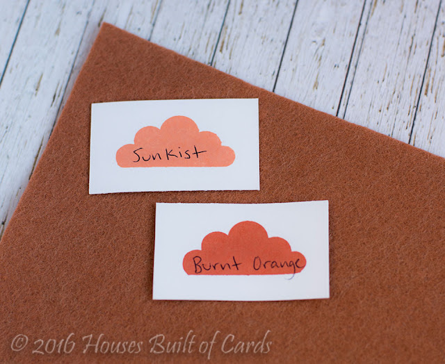
Then a warm, slightly rusty red color - the color seemed to fit somewhere between Sunkist dye ink and Burnt Orange dye ink - but both coordinated well:
Similar to the last one, but a shade deeper of the same rusty red - Burnt Orange dye ink blended beautifully with this one:
A nice vivid orange - Orange Peel card stock was the closest match - a little lighter as you can see, but similar tones:
A GORGEOUS gray - went beautifully with Smoke Gray Card stock and Smoke Dye Ink - a tad lighter, but hardly noticeable:
Pretty blue gray here - pretty much a perfect match here with Slate dye ink - as you can see in the photo:
A little bit warmer gray with a dab of pink/red undertones. I couldn't find a good ink or cardstock match - but it is a beautiful color!
A nice happy pink color - no perfect matches, but Cotton Candy card stock (although lighter) is a good tone match, and Teeny Bikini dye ink (a bit darker) but still a good match:
A deep rose color - Hollyhock dye ink is a bit lighter, but the tone was a pretty perfect match:
This was one of the hardest colors to photograph - but a nice raspberry color. Doll Pink card stock was a good match, even though it is a bit lighter:
I nice bright cherry red - Lipstick Red card stock was a fairly close match, bit lighter, but definitely not bad for a red match - which is always hard:
A deeper rose burgundy shade - Schoolhouse was a fairly close match - not perfect, but it blended well:
The lightest purple seemed right between Hydrangea dye ink and Wisteria dye ink - with Lavender card stock being the closest blend - a little lighter, but blended quite well for sure:
There is a darker purple as well - couldn't find a good match in the ink that I have, but it is a lovely royal purple:
This one I would have called green, but when I started putting ink next to it, it seemed a closer match to the Teal dye ink than anything - although there were definitely some color undertones that blended beautifully with Spring Rain Dye ink - I really love this color:
Another nice bright color - this is a lime green, nice and vibrant. No card stock or ink matches though:
A soft yellow green - I think that Catkin dye ink was the closest match, but Goldenlocks dye ink also blended in with some of the undertones in real life - even if the photo doesn't do it justice:
A nice avocado green - Green Apple card stock was the closest paper match (obviously lighter, but a fairly good tone match) and it also seemed to fit between Willow dye ink and Catkin dye ink:
A nice true green - Lucky dye ink was a great match:
A slightly deeper green - no great matches with ink or card stock, but a good forest green color:
And an even deeper green - Midnight Green card stock was a great match for this one:
The lightest shade of brown was a perfect match for Dark Chocolate dye ink:
And the darker shade went beautifully with Dark Chocolate card stock - obviously these browns would all play well together:
This blue was a beautiful true blue - Caribbean Blue dye ink was a great match for this one:
Slightly lighter blue - no great matches for card stock or ink, but it makes me think of the sky:
A nice turquoise teal blue - High Dive dye ink was a beautiful match, and Island Blue card stock was reasonably good - maybe not both together though:
A lovely navy blue - both Soft Navy dye ink and Soft Navy card stock went well with this one, even if a bit darker:
This was sort of a royal blue color - a bit of a cross between a purple and a blue. Blue Violet card stock was the closest match - not perfect, but it gives you an idea of the color:
Then a little deeper of the same royal blue - couldn't find any ink or card stock matches, but it's beautiful:
And finally - two black pieces - nice and deep and true black color:
I also had ordered this Pastel Felt Set - and while the yellow and peach color are shared above, the blue seemed unique to this collection, so I added a comparison of it as well:
I nice deep minty color - you can see that it fits somewhere between Mint dye ink and Spring Rain dye ink - and the closest card stock matches were Audrey Blue and Mint (card stocks weren't as close a match as the inks though:
And finally - two others that I received, but not certain what sets they came from - they were part of the package I got with my samples to create with the new release.
This one is a lovely bold pink - Hollyhock dye ink is a good match, and even though it is a bit darker, Doll Pink card stock blends quite well:
And this gray - slightly similar to the gray above, but a little less blue. Slate dye ink and Slate Gray card stock were both beautiful matches:
And finally, a little peek at a set of cards that I put together using all this information once I compiled it! This blog post is FAR too long to write it up on the tail end of this - but thought it might be nice to see how handy it is to know what inks and card stocks coordinate well with the felt!
I'll be adding a blog post soon with the detail on these cards! Thanks for stopping by - and hope this information is helpful for you! Have a great day! :)


WOW, what a monumental task to take on, but sooo valuable! Thank you for doing it and for sharing it! I will definitely refer to it! I have their inks, but not their card stock as it is too costly to mail over seas! :(. Your cards are gorgeous! Thanks for such a wonderful post :) :). Cheers, Dotty
ReplyDelete