
Good morning! So excited today to be hopping along with Pinkfresh Studios as we celebrate the BRAND NEW July Release! You aren't going to want to miss a stop along the way - TONS of inspiration and prizes up for grabs! YAY!
I have a $25 gift card up for grabs here on my blog (details below) - and the ENTIRE RELEASE is up for grabs as well! See details on the Pinkfresh Blog! Pinkfresh Studio is also having a special promo in honor of the new release! Between now and July 13th head to the Pinkfresh Studio Store and use code "FREESHIPWITH50" for free US Shipping and $5.50 off international shipping!

I have two cards to share with you today using some of the new stamps and dies!

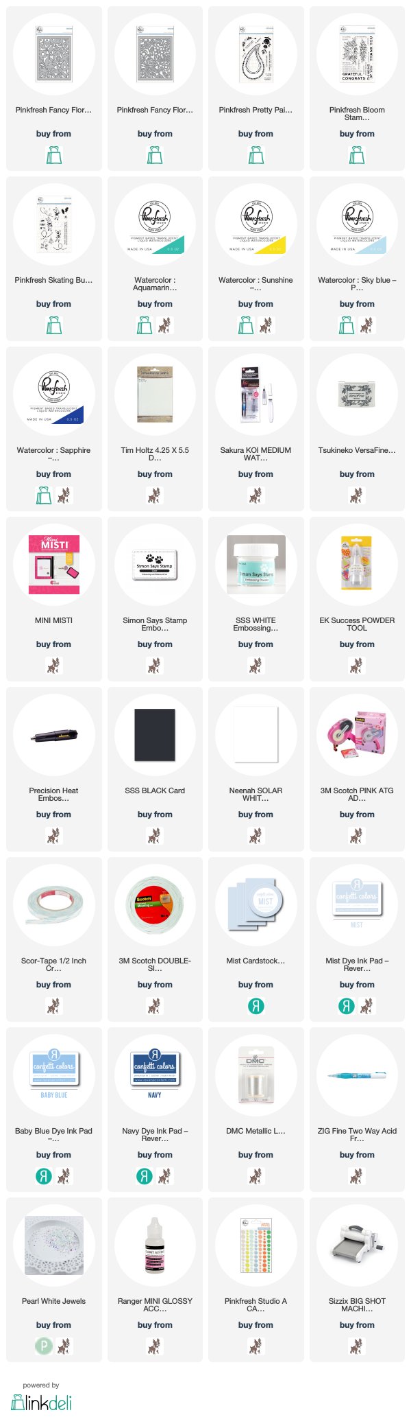
My first card features two fabulous dies that work together - or separately if you prefer! I used Fancy Floral 1 Die and Fancy Floral 2 Die layered together for my card today - die cutting them both from watercolor cardstock, then layering together with a glue pen over another panel of watercolor paper before adding a messy and splattery watercolor wash with some of the fabulous Pinkfresh watercolors in Sunshine, Aquamarine, and Sky Blue (with a touch of Sapphire mixed in). Can you see the lovely dimensional texture here?

I absolutely love the texture from this - but the possibilities with these dies are endless! You can layer together different colors of cardstock for another neat effect as well.

I finished off with a sentiment from the new Bloom Stamp Set, heat embossed on a piece of black cardstock with a bit of silver thread tucked underneath - and a few Pearl White Jewels from Pretty Pink Posh for a touch of bling.

For my second card, I have this simple and clean card featuring the fun new Pretty Paisley Stamp Set:

As soon as I saw this stamp set, this floral image caught my eye. It looked almost Scandinavian - and somehow the blue and white color combo seemed perfect for it. I stamped it in a repeating pattern on a panel of white cardstock in a medium blue ink, then stamped the sentiment from the same set below in navy ink. It's hard to see in the photos, but I also added some random dots in a softer blue ink using the snow image from the new Skating Bunnies Stamp Set - adds a fun bit of texture! Finished off with some machine stitching around the edges, a few Pinkfresh Enamel Dots, and a soft blue cardbase.

Which card is more your style? Clean, simple, and monochromatic? Or the texture and dimension with messy watercolor on the first card? And what is on your wish list from the new release?!?!?

Giveaway Info:

Make sure and leave a comment before you leave for a chance to win a $25 gift certificate to Pinkfresh Studio! Winner will be posted on the Pinkfresh Blog on Sunday, July 15, 2018 - so make sure and check back to see if you were a winner! Winners must check that page and claim their prize within 2 weeks.
Here is the entire blog hop line-up so you don't miss a single stop - and product links are below - including affiliate links where possible, which simply means if you use one of the links below that I receive a small commission at no additional cost to you. Thanks so much for stopping by! Have a wonderful day!!!
Cute cards. Thanks for sharing.
ReplyDeleteLovely cards and this sunshine yellow is amazing!
ReplyDeleteThe cards are so pretty! Loved them! Thank you so much for inspiring and for the opportunity to win!
ReplyDeleteLove the new release! :D
ReplyDeleteGone are my good intentions of reducing my spending on craft supplies...! ;)
Beautiful cards! Thank you for sharing!
ReplyDeleteOh wow, those watercolors are so beautiful and vibrant! I just love how much texture and movement you got in your first card by layering that cover plate and using the watercolor inks... simply stunning!
ReplyDeleteThese are so beautiful!
ReplyDeleteTwo stunning cards, do love the amount of texture you created on the first card but my style is the clean, fresh look of the second card. You ask what's made my list off this collection, is it to greedy to say out loud the entire collection ?
ReplyDeleteHeather I love how you did this card! The cover die is so pretty and then to add those beautiful colors! Perfect!
ReplyDeleteBoth cards are beautiful, but the watercolor one is stunning!! 😍
ReplyDeleteSo beautiful!
ReplyDeleteLovely cards Heather! I really like your blue Scandinavian inspired card.
ReplyDeleteThose Fancy Floral frames are lovely and I love the pretty colors you used for them!
ReplyDeleteI love the cards!
ReplyDeleteFantastic cards!
ReplyDeleteFabulous cards.
ReplyDeleteI really love
the dies and
colors of the
first card.
Carla from Utah
This comment has been removed by the author.
ReplyDeleteLove the colors you used on your cover plate card. As a fan of paisley anything I also thought the flower card was very sweet too💖💖💖
ReplyDeletePretty cards! I love the colors.
ReplyDeletePretty cards, Heather! I also liked those pretty florals and thought they looked more Scandinavian.
ReplyDeleteI love how you stamped them and the blue is so pretty.
Very beauitiful cards! I love this release. It is fabulous!
ReplyDeleteLove these bright and beautiful cards!
ReplyDeleteLove your card It's gorgeous..
ReplyDeleteSo loving these bright colourful projects you've shared today. Thanks for the inspiration.
ReplyDeleteGreat use of the background die. Beautiful, Heather! =)
ReplyDeleteI love all of the beautiful colors
ReplyDeleteGorgeous cards! Love the scandi look and all your bright colours too. Lots of inspiration!
ReplyDeleteBeautiful cards love the new frames, such an amazing new release!
ReplyDeleteThe texture from the die is fantastic. Love the colors on both cards, too. Thanks for sharing!
ReplyDeleteI had already spotted the matching flower background dies and now, seeing your beautiful cards, I see that they are really great dies ! With your happy coloring, the result is stunning !
ReplyDeleteBoth cards are beautiful but texture and dimension with messy watercolor are definitely more my style - the messier the better hehe. Hmmmm, maybe that's why I love mixed media projects so much LOL! My wish list includes pretty much the whole collection but the florals are at the top of the list :)
ReplyDeleteThanks for sharing your pretty creative ideas.
ReplyDeleteBeautiful cards! I particularly love the Fancy Floral die!
ReplyDeleteThis entire release is fantastic. Love it all
ReplyDeletelovely cards - the texture and designs are awesome :)
ReplyDeleteGreat cards. Love the water colors.
ReplyDeleteYour cards are so fun!
ReplyDeleteNice cards. Love that blue card! My favorite.
ReplyDeleteFabulous cards!! Love how you used the watercolors!!
ReplyDeleteSo pretty - love the soft colors.
ReplyDeletegreat watercolor look!
ReplyDeleteBeautiful cards! Love the layering die cut look with watercolor! The Christmas toy shop is definitely on my wish list. Too cute!!
ReplyDeleteGorgeous cards. I love the simplicity of the second card but I love the colors on the first card.
ReplyDeleteBeautiful cards! I especially love the beautiful bright colors in the first card. I bet those watercolors are super fun to work with!
ReplyDeleteLovely and elegant cards! So beautifully designed. The simple color combination and Scandinavian images of the blue card has captured my heart.
ReplyDeleteI am blown away by what you created! You are so talented!
ReplyDeleteBeautiful new dies from Pinkfresh! I love your cards!
ReplyDeleteBoth cards are lovely!
ReplyDeleteSuch great cards.
ReplyDeleteThanks so much for sharing...
Both cards are beautiful. I love the colors you used with this new release.
ReplyDeleteBoth of your cards are beautiful! I think the CAS blue & white card is my favorite :)
ReplyDeleteI love both cards and styles! Love the whole release, especially the background dies.
ReplyDeleteBeautiful cards! Thanks for the new tips!
ReplyDeleteThese cards are so beautiful--great color combinations for each design. tfs
ReplyDeleteI don't know which card I like more; both are fantastic!
ReplyDeleteGreat release! I love how you used the Fancy Floral Dies.
ReplyDeleteI love this release and your lovely cards!
ReplyDeleteLove the bold color on your die cut piece! On your second card, the images, along with the message, are veery effective.
ReplyDeleteLove both your cards but the messy watercolor is more my style. I really like these floral cover dies from this release and the Leafy Backdrop.
ReplyDeleteVery nice cards, the blue looks great with the yellow.
ReplyDeleteHeather, these are both gorgeous!
ReplyDeleteLove the blue simple card. It reminds me of a delicate pattern you'd find on a vintage dish cloth or teacup!
ReplyDeleteYes Yes Yes!!! I am loving that you used the liquid watercolors that were just released on your card. Just stunning with the new product
ReplyDeleteThe monochromatic simple card is more my style but both cards are so well designed. My fav from the release is home for the holidays with the matching Die set.
ReplyDeleteBoth are great cards. They are very different in design, but equally nice. I liked the Pinkfresh items you used.This release just has A LOT of great stuff to choose from.
ReplyDeletePretty cards. Love the dimension! :)
ReplyDeleteI love this bright, fresh color! Really pretty cards and really pretty idea!
ReplyDeleteLove the colors! Beautiful cards!
ReplyDeleteBeautiful work, Heather!
ReplyDeleteWonderful cards. I am more of clean and simple card maker.
ReplyDeleteBoth of your cards are absolutely fantastic !!
ReplyDelete[margessw(at)icloud(dot)com]
Both cards are and bright and colorful. I just love the way you highlighted the products.
ReplyDelete