Good morning! I recently saw a couple of mugs advertised on Facebook, that totally inspired these cards using a couple favorite stamp sets from from Simon Says Stamp, paired up with some distress inks - I so love how this idea translated into these simple card designs! And I can't seem to keep enough birthday cards around - not to mention, it's always a bit harder to come up with a simple masculine design.
These are both fairly similar - but I always like to just slightly vary the design (at the very least!) when creating multiples. Sometimes I change up the colors - but this time I used two different sizes of trees, changed the ink blending a bit, and switched which side I added the images and sentiments too.
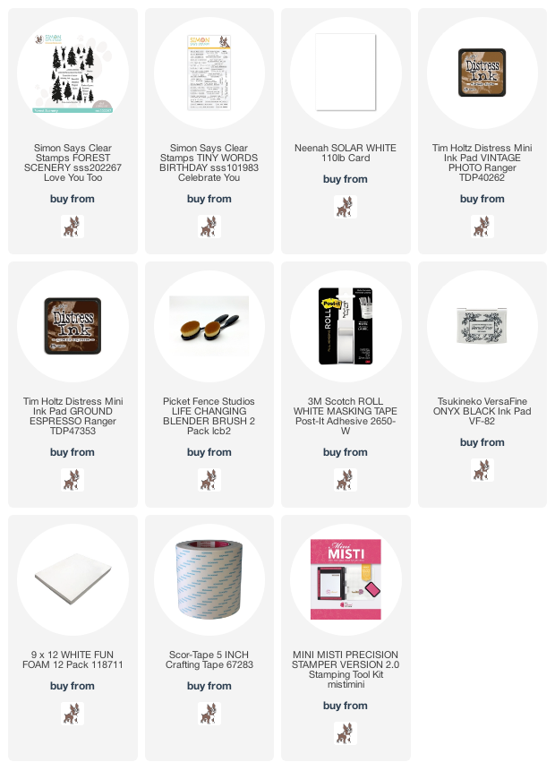
For both cards, I used some post-it tape to mask, and distress ink to blend. I tore the edge of a strip of of the tape to add a bit of an imperfect edge, and started at the top, blending with Vintage Photo distress ink. As I moved down, I kept blending a bit darker each time I moved the tape for an ombre look. I also purposely kept the layers uneven.
Once I had the base on each panel, I went ahead and added some splatters with Ground Espresso distress ink. I smooshed the ink cube onto my glass mat, added a bit of water, and flicked that on. I set them aside to dry - which didn't take very long, but I didn't want to risk smudging my efforts.
Next, I chose two different trees from Forest Scenery stamp set - one of my very favorites! I stamped using my MISTI and Versafine Onyx black, stamping a couple times for a nice crisp and deep impression.


I absolutely LOVE these cards, Heather!!! So fabulous!!! Every detail is so perfect!!!
ReplyDeleteI love the brown ombre layers. Thank you for the details on how to do that. I think you are right, this design is so versatile, you could do it in several colors.
ReplyDelete